Think To Ink
Providence, RI
Postcard
Challenge: To develop a series of promotional cards
and products created by the Think To Ink brand to
either introduce us to you, or remind you about us –
to keep us on the front burner of your mind so that
when you begin to think about your next piece of
graphic communication needs you include us in your
plans.
Solution: Using previously-established red-and-blue
branding, with familiar pairs of items that work well
together. Coming soon… peanut butter and jelly,
chocolates and strawberries, salt and pepper – fun!
Postcard
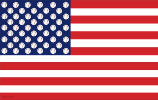
Challenge: Just a piece of art/whimsy I put together
one day with the hopes that someone at the Major
League Baseball Association will pick it up and want to
sell them at every major league baseball Gift Shop.
Solution: Well, after all – it is The American Game!
As for the Gift Shops…not yet!
Poster
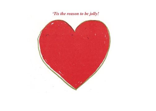
Challenge: No pets, vacations, or grandchildren to
promote on this year’s holiday card – so thinking
about what I do have to be grateful for…
Solution: Recognizing the very special place my
friends and family hold in my heart, I drew upon the
heart icon. The people to receive the card saw their
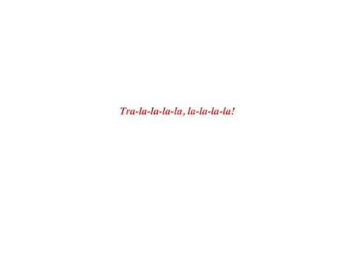
name placed within it, with familiar holiday refrain on
front and back.
Holiday card front
Holiday card back
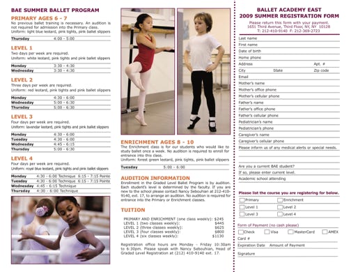
Tri-fold Brochure—Outside
Tri-fold Brochure—Inside
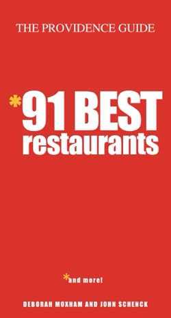
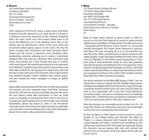
The Providence Guide: 91 Best Restaurants
Providence, RI
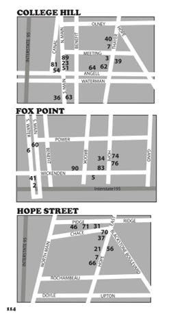
Challenge: To design a user-friendly book where
the wealth of information is easily accessible in a
multitude of ways: by restaurant name, by a
numerical index, or by geographical location.
Solution: The Guide was designed to a familiar
pocket size with a high-visibility cover and a catchy
title (91 rather than 90!). A distinct bold typeface was
specified to establish restaurant names and numbers
consistently throughout the book, and maps were
created using only the information necessary to find
each specific restaurant.
Cover
Map
Inside spread
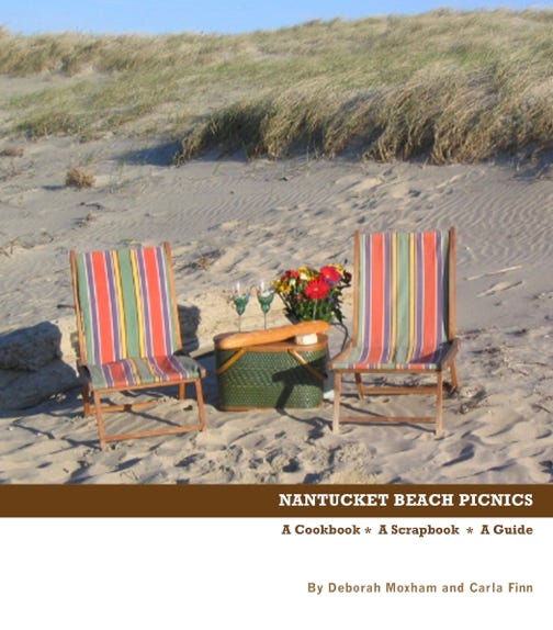
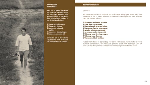
Nantucket Beach Picnics
Rhode Island
Challenge: This book was self-published, and the
authors expressed a desire for it to be designed in a
cost-conscious way.
Solution: Rather than incur the expense of full-color
food photography, four generations of the authors’
family photos were used, printed in one color, to
reflect the charm of Nantucket – yummy!
Cover
Inside
Logo - Young Voices
Logo - Youth In Action
Logo - Mosaic Latin-American Bistro
Logo - Humanities Forum Rhode Island
